This post may contain affiliate links and/or editorial content. See our disclosure statement for details.
A parking space has a practical job, but it also gives a home, office, or shop one small chance to show personality. A plain rectangle of pavement becomes memorable when a sign adds a dry warning, playful rule, or joke about the driver who ignores it.
The best message stays readable from several feet away and suits the setting. A few simple choices turn parking humor into useful decor and lead to a sign that feels deliberate.
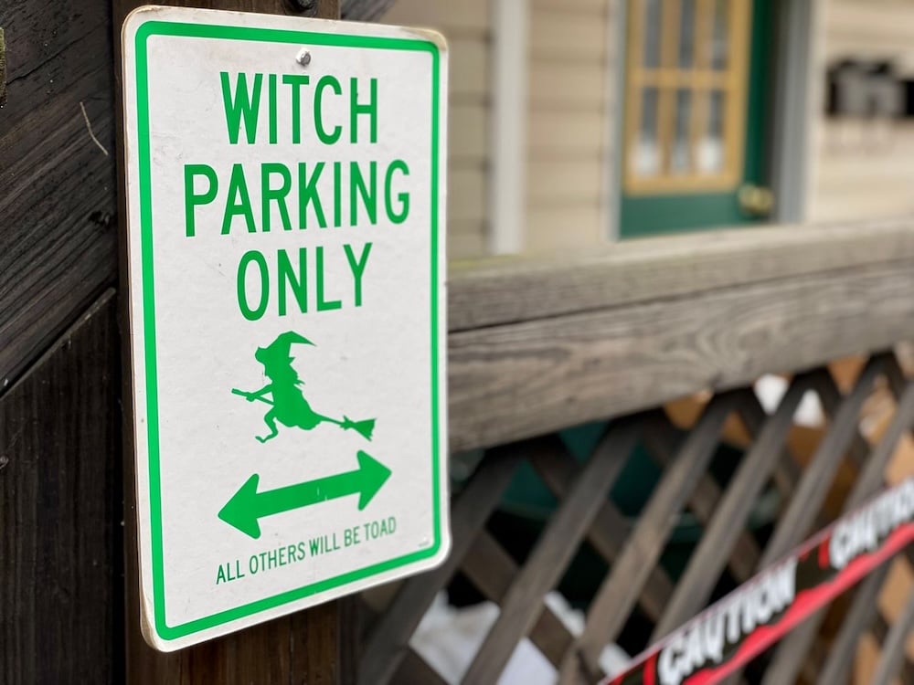
Photo credit: Steve DiMatteo
Start With The Space
A sign should match the space. A private driveway needs a different tone than an employee lot or customer area. The wording should remain clearly personal rather than sounding like an official traffic order. For light messages that clarify a boundary, funny parking spot signs provide useful starting points. The final choice should fit the property and its audience.
A home driveway allows more personality because visitors already recognize its private nature. A garage wall can support a joke about parking skills, vehicle loyalty, or household rules. An office or retail property needs a milder message that remains friendly to guests and coworkers.
Choose Humor That Communicates
A parking joke works best when readers understand it within a few seconds. Long sentences become difficult to read beneath small lettering, especially when drivers see the sign through a windshield. Short wording creates a faster reaction and keeps the practical message clear.
The message also needs a clear purpose. A sign can reserve a space, discourage casual parking, welcome a favorite driver, or add character to a garage. Humor should support that purpose instead of hiding it behind a complicated punchline.
Make Readability The First Test
Placement controls how well a sign works. A driveway sign should face approaching vehicles, while a garage sign should sit near eye level. The chosen location needs enough light for visitors to read the message during evening arrivals.
Letter size matters as much as the joke. Drivers should not need to stop, walk closer, or squint to understand the wording. A quick test helps: stand several feet away, glance at the sign for two seconds, and check whether the message remains clear.
Keep the background and lettering easy to distinguish. Busy patterns, low contrast, or crowded wording weaken recognition. A clean layout gives the humorous line room to work without creating confusion.
Keep The Tone Friendly
Parking humor should create a smile rather than start an argument. Messages that insult strangers, mention threats, or sound aggressive can make a property feel unwelcoming. A playful boundary communicates ownership without turning a routine parking issue into a personal dispute.
Consider the people who will see the sign repeatedly. Family members, delivery drivers, neighbors, and customers respond better to humor that feels deliberate and light. A message that earns a laugh on the first visit should still feel acceptable after months on the wall.
Find A Natural Spot For It
A funny sign fits well beside a home garage, above a designated driveway space, or near a private parking area. It also adds personality to a workshop, recreation room, or covered vehicle storage area. The setting should support the message and give viewers enough time to read it.
A sign becomes more convincing when its location feels intentional. Mounting it beside the space works better than placing it behind parked vehicles or near unrelated clutter. The surrounding area should keep attention on the wording without requiring extra decoration.
Use The Sign As A Small Design Choice
The best parking humor feels connected to the property. A garage with a playful personality can use a bolder joke, while a neat front entry may suit a shorter, quieter message. Matching the sign to nearby colors or decor helps it feel like part of the space.
Before mounting anything, measure the available area and review the viewing angle. Confirm that the sign will not block required notices, obscure visibility, or interfere with vehicles. A funny detail should improve the space without creating a practical problem.
Conclusion
A boring parking spot needs little more than a clear message and a sense of timing. The right sign matches its location, uses readable wording, and keeps the humor friendly for regular visitors.
Property owners can begin by choosing the audience, testing the message from a distance, and checking the mounting area before installation. That process turns a plain parking space into a memorable detail that still communicates exactly where drivers should stop.